Pages

People and Place

Monday 30 April 2012

Making Figures Anonymous

For this exercise we are asked to to make between two and four images using different techniques, deliberately making the people anonymous but is primarily about the place.

The first image I have used the technique of facing away.  To achieve this I have taken the picture from a higher vantage point so as to obscure the faces of the the two men having coffee but to show the table and chairs and pavement.

The next image I have used the technique of partly obscuring the person. I have deliberately taken the image so that the faces of the people are in the reflections of the water on the ground.


The next image uses the technique of taking the person in silhouette and making them small.

My final image for this exercise is to use motion blur.  Even though the person is facing me by using a slow shutter speed while they are walking past blurs the face making them unrecognisable.

Sunday 29 April 2012

Visit to RIBA

On Wednesday evening I attended a talk given by the assistant curator, Jonathan Makepeace, at the Royal Institute of British Architects (RIBA). It was a general introduction to the rich resource of the RIBA's collection of architectural photographs. 

The Photographs Collection  is intended for the study of architecture and related subjects such as interior design, topography, landscape, construction and planning.

It contains over 1.5 million images in a wide range of formats that includes negatives, prints, transparencies, postcards and digital files. The images include works from the earliest photographers and architects to the present day.

In two and a half hours it was only possible to see a tiny selection.  What we saw was an extraordinary selection of some of the most well known masters of photography, many of them unknown to me before.

My preference and interest in photography has focused on images of people.  My favourite are documentary or portrait  photographers.  To begin with I thought I was going to find it difficult to summon enthusiasm for architectural photography, so I was pleasantly surprised when I discovered exciting and inspirational work.  Eric de Maré, Lucien Hervé, Hélène Binet for starters.

This evening I was introduced to even more photographers and concepts that got me excited and wanting to know more about their work and practices.

One of the first surprises was that most of the early architectural photographers were actually architects.  It makes sense but I had never thought about it before. Architects understand how to draw buildings correctly, how to correct converging verticals.  These skills transfer comfortably to photography.  They knew how to use the bellows and lens, moving them independently to correct these distortions.  Today we use tilt and shit lenses.

Others transferred comfortably from painting and drawing to photography.


One of these was Edouard Baldus, who came to Paris to study painting. After ten years with little success as a painter, he abandoned his easel and picked up a camera. He was quickly recognised as a photographer with a unique ability to combine aesthetic sensitivity with technical accuracy. This won him a contract with the French government to document the Roman and Medieval buildings of France.
                      

Many of the early images included more of the environment creating  beautiful images of the building or structure, the environment and often included people. An example of this is shown in Samuel Bourne's photo (right). A statement on things as they exist. An accurate record of the place.                                                            Many of the items in RIBA archives have details and notes on the back of the prints outlining how the photographer wanted the image processed.  How it was to be cropped. Areas specified where dodging and burning was to take place.  Even cloning out details. Photoshop has not brought us anything new, just an easier way to do it.

In the early 20th century Eric de Mare was one of Britain's most influential architectural photographers, he focused on industrial structures this work became known as "functional tradition."  His images were carefully composed, everything within the frame had been considered. He was hugely influential on architectural photography taking it outside of the confines of the architects realm, appealing to the wider public.  An example of his work below shows how striking his images are.  I love the juxtaposition of old and new and how it is beautifully framed by the trees.  An image like this is still striking in the 21st century. 


By the 60's and 70's the style of architectural photography was more graphic in style and focused on detail shots. A classic example of this type of work is by Judith Turner.  This modernist approach was controversial just like everything else in this period.  It reminds me a little of the clothing fashions of the time.  When I look at this image I think of Mary Quant.


Another even less popular style of architectural photography appeared around 1969- 1970.  A body of work titled Manplan was commissioned from a group of photojournalists.  This was far removed from any previous architectural photography, largely shot on 35mm film, lots of people and showing life as it really was. Often taken under grey skies or wet weather these grainy images were not popular with the architects who felt these images reflected negatively on their work.


The evening passed really quickly so it was a very quick look at photographs from the 21st century.  Richard Bryant is one of the most widely known and respected architectural photographers at present.  Most of the images we are seeing now are beautiful crisp, glossy, coloured images. 

Revisit Image British Museum

I've just upgraded to Lightroom 4 and am learning how to use the perspective tools.  I decided to revisit on of the images from assignment 3 in the British Museum.  Although I thought I had done a reasonable job of straightening and fixing barrel distortion, my tutor felt it was still a bit unbalanced.

So after a bit of playing around to learn how to use the new features in Lightroom 4, I think the image is better balanced now.  I have removed the barrel distortion. Used the rotate and vertical adjustments using the plinth in the centre of the image and the doorway as guides.

I think my original edit was too bright and I lost too much in the highlights.  I have changed the colour balance and brought up the shadows a bit more so there is more detail in the couple in the foreground.  By reducing the highlight adjustment there is now more detail in the ceiling.  I think this is a better adjustment.


If I compare it with the previous version:

Friday 27 April 2012

Relook at Blackfriars Image

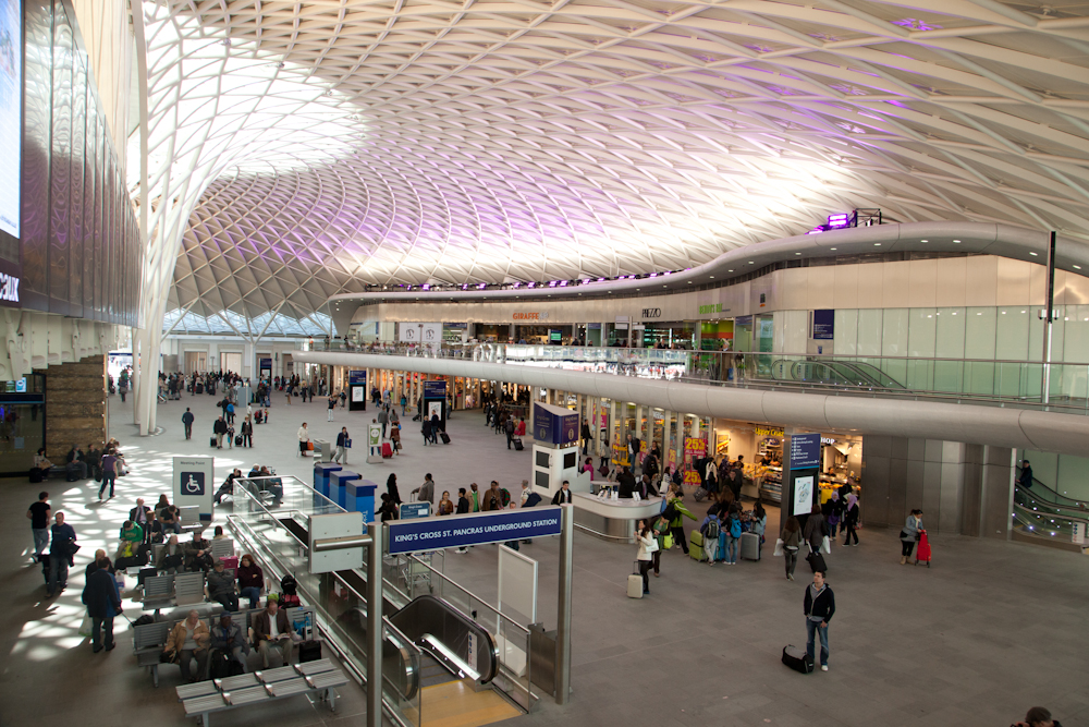
One of the photos from assignment three I discussed with my tutor was the one of Black Friars Pub.  His comments were that it looked a bit wonky.
This is the image:


I agree it is wonky. I had tried to correct it using the distort filter in photoshop.  I decided to have another look at it and see if I could do a better job. When I went back to the original file here:


Here is a less radical adjustment:
This is better but there is still something not quite right with this image. I went through some of the other pictures I took that day and decided this one was better. This has been corrected slightly using the distort filter in photoshop:
I think this is a better picture. What I have learnt from this is the benefit of going back to previous images. And why you shouldn't delete your rejects. You may discard them one day then go back and see them differently another day. I find when I am working on an assignment I get so focused on the ideas at that time that I stop seeing other ideas and concepts.

I had discarded this image in my previous selection because I didn't like the figure in the doorway.  I thought it cluttered and  distracting. I preferred the man stepping into the image.  In concentrating on this aspect of the image I overlooked the more important factor of the wonky building.
Even though I realise that my perspective correction was over corrected and I had made more distortion rather than correcting the problem, the second image is actually better. By a slightly different composition, one that moved the edge of the building away from the edges of the frame when using a wide angle lens, the original has less distortion to correct.


Thursday 26 April 2012

Busy Traffic

The aim of this exercise is to show the busyness of the place with a pleasing composition and to give a good sense of the nature and function of the place.

I've chosen two images with two different approaches.  The first image (above) shows a group of tourists huddled together on the bow of a ship. Rather than a flow of people this is a huddle, implying both a small space and that it is cold. The arrangement of the group suggests they are all viewing something, confirmed by the cameras ready and waiting.
The cold is verified by the snow covered mountain in the background as well as their clothing. I've positioned the shot so that the people resemble a triangle shape matching the triangle of the mountain behind them.  One person is holding his camera above his head creating another triangle.


The second image I have taken from a high point looking down. This time the flow of the people becomes the central theme of the image. A busy rail concourse with people moving about. It is easy for this type of shot to just look messy and not very interesting.  What I have aimed to do here is to use the light and the shapes to create pleasing patterns.  I took several shots over a lengthy period of time until everyone was in a position that matched the patterns created by the light. The people are now all on the corners of the light patterns mimicking the pattern of the shadows and light.

Monday 23 April 2012

A Single Small Figure

The challenge for this exercise was to be able to find somewhere in London where a single figure would enter the frame. I decided the back or side of a building might offer me more opportunities.  The image here is the back of St Martins in the Fields.  I liked the uniformity of the windows and in particular the shapes in the central window. This turned into a waiting game. Lots of couples walked by. I also wanted someone in neutral colours. Wearing red would have made the figure more prominent in the picture.  My interpretation of the exercise was to make the person appear small, so someone in black or grey was what I was after.  Eventually this person walked into the frame.  I chose him walking out of the frame for two reasons. First when he came around the corner he was facing me, I wanted him more anonymous. Secondly I wanted to try and match him to the dark grey stone on the pavement. I felt that positioning him in this spot accentuated the size of the building and was placed so at first he isn't obvious.  Putting a figure in a picture like this, keeps the building the main feature of the picture, but adds interest and also scale to the image.

I have taken a second image similar to the one above but this time complying with the rule that the figure should walk into the frame not out of it. Is it better balanced? Probably it is.  The second image also has a curved white line leading to the figure.  This also helps to give the picture better balance. The lighting is also better in the second image giving more depth to the scene.

I am still happy with the first image but the second one shows that you can do better by waiting for all the components to come together.

Wednesday 18 April 2012

Workshop

Last weekend spent on a workshop on the theme of documentary photography. It was a full on experience.  On the first night the tutors gave presentations of their work, followed by all of us attendees showing our work.  What a mixed bag we were. The next day some of us did a session on lighting, others saw a presentation on the elements of putting a photo essay together.  We then split into different groups and went out to take photos with the aim of putting an essay of no more than five images together on our return late afternoon. Working with both professional tutors and your peers made me realise what it is that I am missing with the OCA.  Fantastic input from tutors with lots of practical advice is one aspect.  Working with other photographers, some better than yourself some not really helps with how you see your own work. Just different points of view, different ways of thinking and seeing.  I got a few great photoshop tips, I listened to how others saw the same things that I was looking at but with a different outcome.
The last day we covered legal rights, using other media and had portfolio reviews.
I do need to spend time now thinking about what direction I will take following this course.

Friday 13 April 2012

Assignment Three: Buildings in Use


Summary Evaluation


Preparation:
This assignment has proven to be the most difficult I have done to date. The first challenge I had was in really understanding the brief.

Take two to four pictures of five to six buildings so that you have:
  • a good understanding of how and why each building was designed the way it is and
  • an opinion on its effectiveness as a usable space.
I had to get past thinking this belonged in an architectural course as opposed to a photography course. I asked several photographers, a few teachers and many friends how they would interpret the question, and point me towards some resources in this area.

Next, I spent countless hours in book stores looking through architectural books and magazines. I looked at models in architects offices. I sought, and found, photographers that specialise in this area. A new world opened up to me. I was beginning to change my view and attitude. I found work that truly inspired me. My favourite photographers at this point in time are Lucien Hervé, Eric de Maré, Hélène Binet and André Kertész.

What was it about their work that I found inspiring? It was the use of light and shape. What I came to realise is just how important these two aspects are in this type of photography. A badly lit portrait or one that is slightly out of focus can still work. The person may be so important, strong, interesting that the technical issues take second place. Not so in architectural photography. Badly lit, out of focus equals boring, bad, dull and lifeless.

Approach:

I had to decide on five to six buildings of various size and purpose. The list started off very grand. Plenty of wonderful and worthy buildings in London. Then I applied some criteria:

I needed: access, permission to take photos, ability to return frequently, variety. My list dropped dramatically. 

I printed some of my favourite images, from the photographers who had inspired me, on ordinary paper and carried them around with me while I visited my potential list of buildings. I used these to help me become aware of how the light worked or in some cases didn't work with the building. 

My final selection was heavily influenced by this approach. I didn't discard every building that didn't have good light, I was just more aware of how this would influence the type of picture I would take. I also visited the met office site every day for a weather and light forecast. I now had a list and an idea of how to proceed. 

Photographing:

I visited every building several times observing how the space was used. What were people doing in the space, how I could visually describe their use of it. 

For some buildings having people in the space was important, in others it wasn't and I thought of ways to symbolise the use of the space. For example is how I used the repeating patterns in the Great Court at the British Museum to represent the donors who funded the glass dome. In the Kings Cross Concourse the main feature is the ceiling that rises out of the floor on a central stem and how the space flowed around it. I used my widest angle lens to show as much space as possible. 

In Black Friars Pub detail was important but light was going to be a problem given how dark the space is. 

For most of the buildings the best light was in the afternoon when sunlight streamed into the interior. Photographing the exterior of the building highlighted the problem of perspective. Without a tilt and shift lens the building will appear to tip backwards. I made adjustments in Photoshop using the perspective tool to correct the lean to a more visually realistic position.

I began the process of selecting the final four images for each building and how they achieved the course objectives. I found that some images did not convey what I wanted to say, and required re-shooting. I needed to take the picture from a different angle, or I needed to concentrate more on detailed aspects of the building. I became very aware of just how important light was to certain spaces. I went back to the British Museum four times for this very reason and until I could get an image I was satisfied with.


Presentation Format:

I have presented the work in five sections, one for each of the building. For each building there are four images and a description of my aim for each picture and how I achieved it.

Links to contact sheets for each building:

Contact Sheets:

http://www.mogreig.com/BritishMuseum/

http://www.mogreig.com/KingsCrossConcourse/

http://www.mogreig.com/HeygateEstate/

http://www.mogreig.com/BlackFriarsPub/

http://www.mogreig.com/RedTelephoneKiosk/


British Museum


Understanding how and why it was designed the way it is:


One of the most famous institutions in the world. The British Museum began as one man's private collections (Sir Hans Sloane). Sloane was insistent that his collection not be broken up after his death and so he bequeathed it to the King for the nation. Following an act of parliament the collection was housed in a converted 17th century mansion on the same site as the current museum, in 1753. The incredible collection of books, manuscripts, natural history and all types of collectibles was neither owned by king or church and was freely open to the public. 

During Victorian time with its colonist attitudes, the collection grew to one of the biggest in the world and it therefore needed a building to reflect the current attitude and to store and display all existing and new acquisitions. The new acquisitions were extensively represented from the ancient Egyptian, Greek and Roman cultures. It was this that influenced the neo-classical reconstruction. It was also the largest building site in Europe at the time. Another statement to the world of the empire's greatness.

To mark the beginning of the 21st century a modern addition was commissioned. Utilising the library space the central quadrangle, the £100 million Queen Elizabeth II Great Court, the largest covered square in Europe was opened in 2000.


An opinion on its effectiveness as a usable space:


Highly effective: six million visitors a year confirms it is a museum people want to visit. Visitor numbers would not be sustained if it was not working. The various spaces within the Museum work on many levels. The grandness of the building from the outside has an immediate impact. A legacy of the empire will live on in buildings like this. The Grand Court has an iconic status that every tourist wants to take a photo of. Any day you visit thousands of people are engaged in some manner in or around the building. Both inside and outside spaces have been designed with people in mind. It is a museum that is easy to spend the entire day in. The various areas are quite separate, the collections easy to see. Resources are easy to use and modern. A problem with museums can often be that you get 'museum legs', the British Museum has lots of rest spaces (including portable seats you can carry around with you). Toilets, cafes, shops and quiet spaces. 

My challenge was to try and take something a little different that would show the museum as it is today and how it is used.

I first sought to find out what most people want to see when they visit the museum. The following four areas are top of most people's list according the museum staff and in the order listed.
  • Rosetta Stone
  • Parthenon
  • mummies
  • Great Court
I have chosen one of these areas to show how the space is used:


    British Museum: 1

My aim here is to show the space being used for the passing down of knowledge. The remains of the statues of ancient Greek women offset against a mother passing knowledge on to her daughter. The photo connects on many levels with the two statues on the right linked together in a similar pose to the mother and daughter. The folds in the statues robes are similar to the folds in the mothers dress. The statue on the right is facing the same direction as the mother and daughter. All linking hundreds of years of women.


A fact not widely known is that the iconic glass ceiling of the Great Court is made up of 3,312 panes of unique individual panes of glass and no two are the same. Each is engraved with the name of the donor who contributed £100 towards the redevelopment. 


   British Museum: 2


My aim with this image was to make a symbolic image to reflect the link that the donors and their families and future generations will have to the Great Court. To achieve this I've used repetition of shape to fill the frame. The top third of the frame is filled with the glass panels representing each of the donors. The light reflected through the panels on to the canopy making shadow shapes of the panels represents the future generations who will feel a special relationship to the space by virtue of their relationship to the donor. A book naming every donor is held as one of the Museum's treasures.


Image British Museum 3, shows how the spaces created around the exterior have been taken into consideration in the design of the building.


                         British Museum: 3


My aim was to show the continuing popularity of the Museum space. People in the 21st century are comfortable in not just viewing the objects in the museum, but in using the space within the grounds around the building. The strongest link is a young girl doing cartwheels in the foreground. Others are enjoying the space to rest, eat lunch or just stroll around.

The Enlightenment Gallery:

This was the former Kings Library, now named the Enlightenment Room to symbolise a new era of enlightenment in Britain.


     British Museum: 4
                
This is one of my favourite parts of the museum, it's not as frenetic as the popular areas and it feels as though you are entering a room in a grand mansion rather than a museum.


My aim was to show the sense of regalness this room offers. Light streams in from windows on both sides of the room. I returned several times until I felt the light was right. I wanted the room to have the golden glow that results when sun streams in. The room is always beautiful but especially so on a sunny day. The wooden cabinets seem to glow, your eye is drawn to the beautiful ceilings.

In showing this space I first couldn't decide between a portrait view to highlight the length of the room or a landscape view bringing the viewer into the room. I opted for a landscape view to show the amount of light that streams into this beautiful space. I took lots of images with people in different spaces. People tend to move more slowly in this section of the museum and browse more. As opposed to the mummies' room where everyone races to the glass cabinets' and immediately start clicking away with their cameras.

I decided that the man and child in dark clothing just entering the room in the right foreground represented people entering into an area of enlightenment.


Kings Cross Station - New Concourse:


Understanding how and why it was designed the way it is:


Things really started to change around Kings Cross with the refurbishment of St Pancras Station to accommodate the new fast lines bringing the Eurostar in to the station in 2007. The development of the area will continue until 2020. The most recent milestone is the opening of the new concourse at Kings Cross Station.

Kings Cross station has been a major hub for both passengers and goods since it first opened in 1852. By the 20th century the station was struggling to manage the ever increasing traffic passing through. The existing concourse has struggled for many years. With the additional traffic brought in by the international station right next door Kings Cross station needed redesigning to handle the 47 million people who pass through each year. A grand new concourse capable of managing these numbers and being sophisticated enough to welcome the international visitors arriving at St Pancras next door was a tall order. On March 19 2012 the new west concourse opened.


An opinion on its effectiveness as a usable space:


A winner in my opinion. The new concourse has been open for less than a month. To form an opinion on the effectiveness as a usable space I decided to check the sorts of things I look for when travelling. I want good access i.e. no stairs or narrow gates that are difficult to pull a suitcase through. I want easy to follow directions, a pleasant and safe place to wait. Something to do while I'm waiting, eating shopping or comfort stop. No queues to get my tickets and a quick to locate cash machine. 

The Kings Cross concourse ticked all my boxes. Each visit I planned how I could portray all of this in images. My aim was show that the concourse is not just functional but also beautiful. The design is artistic and I believe will become as iconic as the British Museum. I've selected four images I think give an air of space and light and a sense of the 21st century. 

Kings Cross Concourse: 1 shows the new entrance. I wanted to highlight the space and the sweeping entrance. I've framed this image showing the sweeping curve of the entrance and offset it with the Victorian Kings Cross Hotel (still being renovated) in the background to emphasis the difference between the modern and the old architectural styles and the difference in the architectural use of light. The hotel has small windows that do not let much light into the space. The concourse mainly glass lets light pour into the space.


   Kings Cross Concourse: 1


 Once inside the concourse my aim was to give a sense of how big the space is. Emphasising the height of the structure and to introduce the artistic design. To achieve this I have taken the picture from the ground level at the base of the "stem" of the ceiling structure offset by passing travellers who are so small by comparison that the size of the structure is more apparent.


                            Kings Cross Concourse: 2


The next image is taken from the mezzanine floor looking across the length of the concourse. My aim is to emphasise the grandeur of the structure and the way the light enhances the space. I chose a spot at the end of the mezzanine floor looking down the length of the concourse and used the widest angle setting I have to encompass as much of the space as possible. I've used the curves of the structure to emphasis the sweeping style of the ceiling and the mezzanine floor and the way the light covers the space. I see it as if a whirl pool of light is rising and falling over the concourse.


   Kings Cross Concourse: 3


My aim for the final image was to show how comfortable it is to sit and dine while waiting for your train. To achieve this I framed the picture as a diner would see the space. From a seated position in any of the cafes a departure board is easily visible. The space is attractive, spacious and light. 


    Kings Cross Concourse: 4


Heygate Estate


Understanding how and why it was designed the way it is:


Heygate Estate, at Elephant and Castle completed in 1974 was built as a modern housing estate. The flats were considered modern light and airy. The multi story buildings were connected with concrete bridges, so residents didn't need to walk along pavements or cross busy roads. The areas between the blocks combined central gardens and children's play areas and aimed to provide places to foster a sense of community. For the period it was regarded as a desirable place to live.

During Margret Thatcher's reign tenants were encouraged to buy their flats from the local authority and many did.

The reality of living in the estate was very different. Residents complained about the noise, violence and crime. The area gained notoriety for gang warfare. The architecture of the 1970's is now looked upon as being stark and brutal. By 2004 Southwark Council were formulating a grand plan to redevelop the area, including Heygate Estate. Planning permission was granted in 2010 and demolition began in 2011. This was abruptly halted due to Government cuts.

People who had bought their flats were forced to sell at a price set by the council. One or two have refused to sell and are still living in the mainly abandoned estate.

Current plans are for work to recommence in 2015. Locals are sceptical. in the meantime The bottom floors of the blocks have been closed off with large sheets of steel to prevent people gaining access.


An opinion on its effectiveness as a usable space:


Failure: Having shown spaces that work extremely well I wanted to show a space that didn't achieve its social aims and hasn't worked.

Heygate known locally as "Colditz" is now a white elephant at Elephant and Castle. My aim with these next four images was to emphasis a large decaying estate.

The first image my aim was to give the sense of abandonment. This I did by placing one of the many signs, that border the estate baring entry, into a prominent part of the image. I've made use of horizontal lines to give a sense of the size of the apartment blocks. More than 1200 flats sit vacant and decaying.


    Heygate: 1


The next image I wanted to emphasis the sense of abandonment. To do this I've made the prominent part of the image the windows that have been sealed with large sheets of steel. The hundreds of TV satellite dishes that still cover the building being symbolic of the people who have left. 


   Heygate: 2


My aim with Heygate: 3 was to show the people who had been forced to leave the estate. To do this I needed a symbol to reflect who those people were. Initially I thought of showing some of the graffiti that can be found around the walls of the estate. Then I saw this sign. Home sweet home. I felt this made a stronger statement linking the empty buildings to people who once called this place home.


    Heygate: 3


One of the 'features' the architects were excited about when designing this building was the many walk ways that linked the estate so that people didn't need to walk along the pavements. I wanted to show these walk ways and how they separate people from the space below. I felt it isolating and wanted to reflect that in my image. I used the setting sun to hit the edge of the walkway that leads into the dark, therefore isolating space on the ground. 


   Heygate: 4


Black Friars Pub


Understanding how and why it was designed the way it is:


Black Friars pub was built in 1875 near the site of the Black Friars Monastery, that gave the area its name. What makes this pub unique is its art nouveau makeover in 1903-1905. The exterior, the work of Henry Poole, is covered in mosaic tiles. A large black monk stands on the front triangle of the wedge shaped building and draws you into the unusual building.

The interior is simply over the top. The walls are covered in green, cream and red marble. Copper friezes of monks adorn the walls. Stepping into the dining area is akin to stepping into a chapel. Words of wisdom adorn the marble walls, punctuated with more monk iconography.

It's as if artists of the time were creating their own Sistine chapel. This treasure was nearly lost in the 1960's as it was marked for demolition. Thankfully poet laureate Sir John Betjeman led the campaign to save it.


An opinion on its effectiveness as a usable space:


Black Friars pub has two totally different ways the space is used. One as a pub the other as a museum or record of an architectural style. Yet the two work comfortably together.

As a pub it works surprisingly well given its small size. A separate place to eat your pie or fish and chips, and a bar that has two distinct areas to enjoy your ale and a large sunny courtyard outside.

However it is as a representation of the architectural style of the early 1900's that I believe it's great value. In this small space both interior and exterior are crammed with craftsmanship and skill that is truly unique. It is listed with the Real Heritage Pubs organisation.

My aim with the image Black Friars: 1 is to show this charming wedge shaped elaborate pub that appears squeezed in among the towering modern buildings that surround it. Yet it is the modern buildings that have come later almost squeezing the pub out.

 
                            Black Friars: 1


The subject of Black Friars pub is the friars themselves. In image Black Friars: 2 I wanted to show a little of the detail that conveys the theme.


   Black Friars: 2


The aim of Black friars: 3 is to show how ornate the interior is. The dining room really reflects this, especially the marble walls and frieze of the friars. No natural light made it difficult to photograph. I used a high ISO and a monopod to reduce the effects of camera shake at a slow shutter speed. A wider angled, faster lens would probably have given me a better outcome. 


    Black Friars: 3


Black Friars: 4 shows the copper friezes that adorn the walls of the main bar. Low light and wall lighting made this difficult to achieve. The interior of this pub is dark and the lighting is always on. I took the picture in the afternoon to take advantage of the natural light that does reach this room. I balanced that with a high ISO.


   Black Friars: 4


Red Telephone Box


Understanding how and why it was designed the way it is:


The earliest telephone boxes date back to the 1880's, but it was not until the 1920's that the iconic red telephone box became widely distributed. How very different they are to the glass and steel versions that emerged from the 1990's albeit that the basic shape is still the same. 

The public telephone box was a means of making the new service of the British Post Office available to everyone. Most people didn't have a telephone in their houses. 

Architect Gilbert Scott won the GPO competition to design the public telephone kiosk. K1 a concrete box was not very practical. In 1924 he came up with the K2. His design was for a silver box with a greeny blue interior. The Post Office decided they would be red to reflect their internal brand colour. 

The K2 proved to be too large and expensive to produce in the numbers the PO required. So in 1929 the K3 was born. A replica of the K2 but smaller.

A unique aspect of Scott's design is the roof of the kiosk influenced by the domed canopy ceilings of Sir John Soane and seen on his family tomb. Scott was a trustee of the Soane's museum at the time he created his telephone kiosk.

Eight thousand of these kiosks were placed around London. It was not until 1935 and the K6, a modified version designed by the Post Office, that the red boxes were installed in large numbers around the country 70,000 were installed between 1936 and 1968, making the telephone kiosk commonplace across all of the country.


An opinion on its effectiveness as a usable space:


As a public telephone the effectiveness of the telephone kiosk probably peaked during the 1960's and 70's. Once telephones in houses became commonplace the use of a public phone reduced. Now with most people having a mobile phone such phone kiosks are limited in their usefulness.

As a public telephone they are now used mainly by the odd tourist and emergency calls to childline.(source redtelephoneboxes.com)

As a tourist attraction they hold a huge appeal, especially in London. It is commonplace to see tourists taking photos of each other in a red telephone kiosk. They are seen as a major icon representing Britain. This has been recognised by the granting of grade II heritage status to 2,500 red telephone kiosks.

Another use that is not approved by the authorities, is as a bill board for sex workers.


I've deviated from the one building for this section and taken the 'red telephone kiosk' as a genre to represent a building. I wanted to stay with the iconic kiosk but show the variations that perhaps aren't obvious to the tourists that love them.

In Telephone Kiosk: 1 I wanted to portray the very iconic status that tourists love. The protected status of this particular group of kiosks means they are in excellent condition. The afternoon sun lighting them means they appear even redder and really look picture postcard. These early versions (K2) have the symbolic Tudor crown embedded in the arch above the telephone sign.


  Telephone Kiosk: 1


The K6 was the most common red kiosk produced as such they don't enjoy the same status and therefore maintenance afforded the K2. My aim was to show how an ordinary red telephone box appears. It is smaller than the K2, the other significant difference is the use of the St Edwards Crown. This change occurred from 1952, the year of the coronation of Queen Elizabeth II. 


   Telephone Kiosk: 2


My aim for the image Telephone Kiosk: 3 is to show its notorious use. A billboard for sex workers. Generally tatty as the cards are constantly changed. It is generally the K6 that is used in this fashion.


                        Telephone Kiosk: 3


Telephone Kiosk: 4 shows how tourists see the famous red box. The majority of these scenes will be at a K2 box, although I doubt that most tourists would know about the various models.


   Telephone Kiosk: 4